He’s a dick, but he’s a local dick

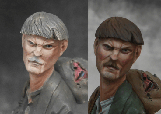
To begin this week, the gladiator has now been finished, and you can see the pictures over on Putty and Paint. I also took a picture of him next to my last gladiator (painted around May this year), which I think shows a really nice progression. It’s good to be able to see improvement over a relatively short time.

P1030442

The plinths aren’t actually the same height, unfortunately; the murmillo’s plinth is basically wearing platforms.

Anyway, with that out of the way, it’s time to move on to my next project.

Last time, you may recall I said I was thinking of doing a Necromunda diorama with the new Escher models I picked up. Unfortunately, I started painting one of them and remembered why I:

a) Don’t paint 32mm any more; and
b) Don’t paint GW any more.

In brief, the details are all over the place, the muscles are just silly to work with, and I honestly can’t get my brush to work with most of the figure. When you’re used to painting models designed with painters rather than gamers in mind, you get a little spoiled.

Anyway, this brings me on to the actual next project: Cromwell. If you read my entries about the English Civil War chap I painted a few months ago, you’ll know I have a dim opinion of Cromwell. He was a right shit, after all.

On the other hand, he was a local shit. Sort of. Cromwell lived in Ely at one point, and that means that one of the two major tourist attractions in town is his house, which features delightfully ugly mannequin sort of things, which you can see in some of the pictures on the official website. Ely’s not a very big town, so we make do with what we have.

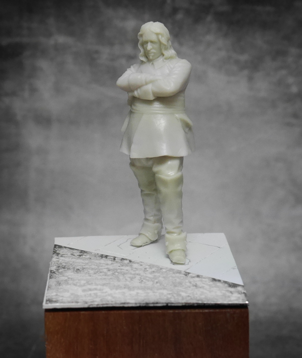
I picked up a new model of Cromwell from Dark Star Miniatures when I was over at SMC. Aside from the fact that there’s a local connection and that I quite like the costumes from that era, I was drawn to the figure because it was sculpted by Mike Blank, and I’d been interested in giving one of his figures a go. They’re all nice, simple pieces with a good sense of character and purpose. They’re also considerably larger than 32mm, which is a real bonus.

Anyway, I decided to set him in quite a famous moment, one that’s been captured in paintings before, but I don’t think I’ve seen anyone do it in miniature: when Cromwell suspended the Rump Parliament.

In brief, Parliament had been due for elections but was saved by war breaking out with the Dutch, so the MPs got to keep their jobs for a little longer – much to Cromwell’s annoyance. Meanwhile, those same MPs were conspiring to preserve their jobs – Cromwell wanted elections (although it’s really unlikely they would have been free and fair elections) but the sitting Members all wanted to just rearrange the electorates and keep membership the same. This all came to a head when Cromwell sat in on Parliament one day, put up with a few speeches, then ordered his soldiers to clear the chamber, glared at the Speaker’s Mace (which is the symbol of parliamentary authority) and declared it a “fool’s bauble” and had his soldiers remove it, too.

As I say, there have been a few versions in art – a few samples:

As you can see, they follow a few staples: Cromwell, the mace on a table, and soldiers milling about with MPs. In the current climate, I’m sure a few people can sympathise with Cromwell, but you have to remember that he was a real dick.

I’m keeping the whole scene much simpler and focusing on Cromwell and the mace, and here’s where I’ve got to so far: some floorboards, a carpet and Cromwell. The table for the mace is a work in progress – I’m trying to make the one visible table leg interesting without being too much, and I’m contemplating not having a cloth over it because it’ll obscure too much of the figure. It’s horribly exciting work.

P1030445

Black and white

The gladiator is nearly done – one or two more sessions and he’ll be ready to sit on the shelf next to the murmillo. There’s not really a huge amount to say about the actual paintwork, but first the pictures:

The main thing worthy of note here is that I finally bit the bullet and used some pure white on the skin. All of the various work I’d tried to get the light working on the skin was ending up a bit wishy-washy – adding shading made the skin a little muddy, and highlighting with anything less than white just wasn’t cutting it.

It’s often said that you shouldn’t use pure white as a highlight because it almost never occurs in nature (unless you’re painting something that should be white, obviously – it would be silly to ignore white as a final highlight for, say, white armour or a white t-shirt), but that argument is weakened when you remember that in nature we don’t have built-in shading or highlighting (for the most part, anyway). Painting a model is an act of contrivance: you’re trying to make a model look like something has been shrunk down and put on a plinth, capturing the drama, colour and light of that scene, and whatever you can do to achieve that is, logically, the Right Thing To Do.

There’s also a strong argument for using pure white in fantasy and sci-fi, where it’s generally accepted that pure white and black can have really powerful, dramatic effects. Some painters do this especially well – Katarzyna Gorska, for instance (it’s possible there’s no actually pure white on here, but if that’s the case it’s so minutely tinted that I’m not sure there’s a painter alive who could spot the distinction).

Anyway, I took the opportunity to feather some pure white into a few of the highlights, and I’m now much, much happier with the skin. That’s what matters, right?

In other news, Games Workshop has relaunched Necromunda, and I’m overwhelmed with nostalgia. I’ve already picked up the Escher set, and I’m really looking forward to House Cawdor. I have a plan in motion for a wee Escher diorama, but I might actually do a gaming  job on the Cawdor stuff if the set is as good as I hope.

Are you not entertained?

Perhaps a demanding title. Anyway, I’ve recently finished the soldier:

P1030426

As always, there are more pics over on Putty and Paint. I ended up bringing a bit more saturation into the jacket, which I think really helps pull the whole piece together. I also added a tiny freehand medal to hint towards his previous employment.

Overall, I’m very pleased with him – I learnt a lot working with the wet palette and introducing more colour and detail into the face. Busts are good like that: lots of opportunities to focus on the fun stuff without getting bogged down in yet another pouch, skull or spike, and without needing to build a base.

So, up next is a gladiator I picked up from Pegaso’s bargain bucket at Euro. I presume he’s being pulled from the range, but that’s a shame because he’s actually a really nice piece. He also came with a number of options – different weapons, shields, etc. – so you can build him as a thraex or a hoplomachus. I liked the spear, so he’s a hoplomachus.

I started out by airbrushing him. I don’t often do this because I’m lazy and getting out all the gear, setting up a spray booth, making sure the airbrush is working, then doing all the layers with cleaning in between as necessary, then cleaning everything up at the end is an enormous ball ache. I should probably do it more because it does make some other things considerably easier – like getting an even base colour on the skin. Viz:

My method here was to undercoat by brush with an old pot of GW Charadon Granite. It’s a lovely dark grey with a green-brown tint, and being one of the old Foundation paints, it’s got great coverage, good durability and it leaves a nice key for paint to go over it. I also like to brush on the first layer because you get to know the model a bit better (as well as making sure you get into every tiny crevice) – you find out about the little quirks, spot mould lines or flash you might have missed, and you get a feel for how the brush will deal with some of the forms.

Over this, I airbrushed a mid brown fairly generously from about 45 degrees, and then VMC Silver Grey from above, but fairly generously again. I like natural ambient lighting, so I don’t want to push really strong lighting too much for this piece. I then focused on the skin, using much thinner paint so as not to undo the previous work, starting with VMC Saddle Brown, then Basic Flesh (I think that’s what it’s called), and a final spot of Silver Grey to reassert the light.

As you can see, it’s nice, but it’s not particularly colourful or dramatic. It’s a really good starting point for the brush, though. This led, over about five hours, to this:

The skin still needs a bit of work to bring more colour in and to focus the light more strongly on his chest and shoulders, but the red is progressing really nicely, as are the quilted trouser-things (ski pants?).

Anyway, he should make a great companion piece to my previous gladiator.

On wet palettes

This week, as you might notice from the title, I’ve finally started playing around with a wet palette. For some reason, I’ve just never seen the need before – my trusty ceramic tile seemed to work fine, and I don’t usually need to preserve a colour mix, so wet palettes seemed pretty redundant.

It was after listening to Mike Blank’s talk at Euro and chatting to Martin that it occurred to me that there’s a little more to a wet palette than I’d really been considering. It’s not that Mike Blank even uses one – he uses strips of masking tape stuck to a block of wood. This, understandably, confused the hell out of everyone present, because it goes against pretty much all of the standard practices, but you can’t argue with the results.

Martin and I were discussing this in the car on the way back home, and the fact that Mike had said that he got a matte finish from paints this way, and it occurred to us that the masking tape was presumably absorbing some of the medium in the paint, which will naturally make the finish flatter. Martin mentioned seeing a similar effect from using a wet palette, so I thought I should finally give it a go. This was solidified in my mind watching Roman Gruba do a demonstration at SMC. Actually seeing a master in action with one is pretty cool.

I could have made one pretty easily (a plastic takeaway tray, jiffy cloth and baking paper will do the trick), but I thought I might as well buy something, if only so it’s easier to transport. I do most of my painting at Inner Sanctum Collectibles in Cambridge, so I need to be able to pack up my stuff and lug it around via public transport.

In the end, I got a Sta-Wet Palette, which more than does the trick. It comes with some paper, but that looks like a pain to prep (you’re meant to soak it for 15 minutes in hot water), so I just cut some baking paper to use. For those who haven’t used a wet palette before, it’s important to note that you need to use siliconised paper, not waxed paper. Waxed paper won’t let moisture pass through particularly well, and the wax could transfer into the paint when you work it, which, I imagine, won’t help.

Anyway, the wet palette is Fun. You sort of poke the paint around until it’s the consistency you want, which is a whole lot easier than trying to get the mix right on a standard plastic or ceramic palette. You can also try out colour blends on the palette really easily because the paint stays wet (literally wet blending).

With that shameless advertising out of the way, here’s the soldier’s progress:

As you can see, I’ve refined the volume on his cheek quite a bit, so the shape doesn’t get lost in fairly bland shading anymore (with last week’s work for comparison):

example2The colours are a little misleading – I haven’t actually changed the skintones all that much, they’re just being picked up more accurately by the camera now that some other colours are in place, and I used a lighter part of the backdrop.

The colour choices were made for me by referring to Russian uniforms from the early 19th century. He’s meant to have been a soldier returning home from war, and I couldn’t think of a set of colours that would do a better job of telling that part of the story (not that it’s necessarily obvious without my mentioning it – I’ll need to add some extra details to sell that).

More generally, I’ve been working on getting a shine on his hair, but that’s not really visible from any of the photos. I’ll need to work that up a bit and spread it perhaps a bit further around so it’s more obvious. Otherwise, he’s pretty much there.

I also bought a daylight lamp this week, so I may be able to finally get some painting in outside of the weekends.

Death and the soldier and volumes

While you might have expected an update about the Roman, I’ll be leaving him aside for a little bit for a couple of reasons:

  1. I need to rethink the direction of the piece. While he’s a perfectly adequate Roman as it stands, it’s not really interesting or eye-catching. Most of the other Pegaso mini-busts are pretty easy to add interpretation to because they’re less formalised. With a Roman, though, you don’t get too many choices of colour. I might end up just finishing him as-is, but I’ll need to consider other options first.
  2. The rod that the bust is supplied with is white metal, just like the rest of the model, which means it’s pinned to the plinth and pinned to the bust. With a weighty chunk of metal on top, the pin can’t really take any jolting and it’s now come loose and is wobbling about and making him look drunk. I’ll be taking him off that rod and replacing it with my usual brass tube, which is a much, much sturdier solution.

So, with the Roman set aside, I’ve decided to do a fantasy-ish sort of piece: Vakula, another of Oleksandr Bilibov’s pieces from Mr Lee’s Minis. Go and buy it. It’s great.

The bust is based on Vakula (perhaps obviously) from Gogol’s short story, Christmas Eve. I’ve been a fan of Russian and Ukrainian authors for quite some time (my favourites are Maxim Gorky, Mikhail Bulgakov and Andrei Kurkov – read almost anything by any of them and you can’t go wrong), so there was already quite an appeal.

However, when I first saw the bust in progress, I thought of a different story: Death and the Soldier, which is my favourite fairy tale. If you’re unfamiliar and don’t like reading, it featured as one of the stories told in The Storyteller, which was a show from the late 80s that featured John Hurt narrating folk tales that were acted out by muppets.

In brief, however, the soldier of the title ends up with a bag that can hold anything, and at some point he ends up with a bag full of devils. As you can see below, that’s the part of the story we catch here:

The skin is most of the way there. I’ve pushed more colour than usual into the cheeks using very thin layers of a pure magenta (although the photos are having difficulty picking that up), but there’s still some shading and refining to go. In particular, I need to sort out his left cheek.

If you’re new-ish to painting, you’ll probably read a lot about “volumes”, which is what I’ll be talking about here. When a painter talks about “refining volumes” or “developing volumes” or, perhaps, “getting all up in volumes” or “taking that sexy volume out for a nice dinner”, what they’re talking about is how to apply paint to accentuate a shape. If you’ve come from the GW army painting school, you’ll be used to defining shapes by putting highlights on all the edges. That’s perfectly valid for an army, but it doesn’t generally cut it for high-level display painting.

By way of example, I’ve marked a couple of lines below:example

In the untouched image, the face looks alright. There’s more shading on one side than the other, however, which means that the cheek on your right is darker overall and, crucially, less defined. He’s got quite angular features and yet this cheek looks like it’s come from a much rounder face. This is the volume, and the aim of “refining a volume” is to either work with it and make sure the viewer sees it as such, or to work against it and somehow conceal it from the viewer. For the most part, painters want the viewer to see all the key volumes from a distance. You might choose to “conceal” a volume if it’s a silly detail or the cast has come out wrong and you forgot to fix it before painting. If you don’t pay attention, you can end up losing a volume and everything looks a little too soft or smudged.

The lines I’ve marked show where I need to accentuate the shape of the cheek. I’m currently thinking some extra shading should generally do it, but with a slight highlight on the skin near the moustache because of the angle of the light.

And yes, I know he’s a little boss-eyed.